
The Northface- 2013
Project Summary:
Redefine the template standards set in the parent site, Vans.com, to create a new visual representation of The Northface website.
My Role:
Collaborate with Northface creative team to deliver the new eCommerce site. Deliver CSS, HTML following mobile-first best practices. Make user experience decisions for newly built features.
Collaborators:
TNF Product Management & Creative Team, Zobrist Consulting’s back-end & front-end dev teams.
Highlighted Feature:
Product Listing Page Filters – The filters on PLP pages have long lived on the left side of a websites grid page, so for this we wanted to design something with low needed interaction and more maintainable mobile-first design standards with more space to highlight TNF’s catalog. By utilizing our existing knowledge, from usability testing and site auditing of existing VF family websites, we were able to create a smoother functionality for users and smoother mobile-first transition to increase load times on these product heavy pages. This feature was then again looked at and redesigned in 2016 based off user feedback and user testing through usertesting.com.
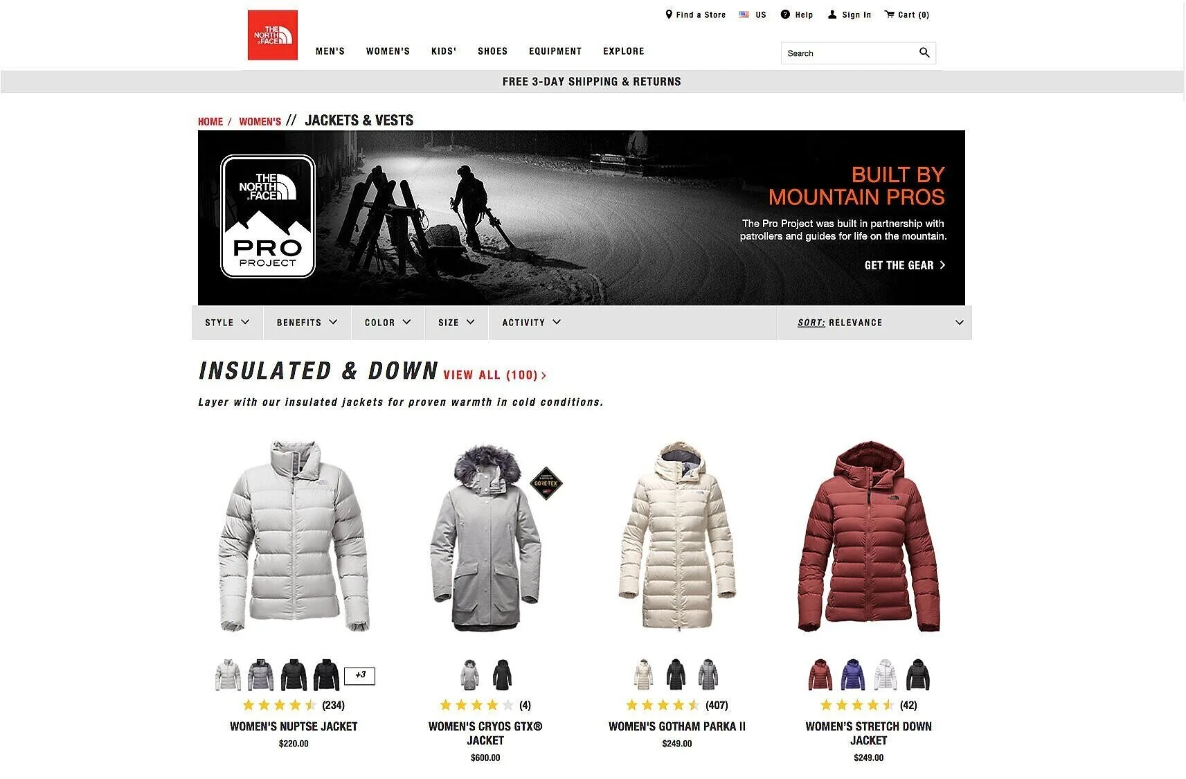
Filters Desktop 2012
Design was moved from the typical left side filtering function to the top of the grid page, this tested well among users and created a much smoother transition for responsive design.
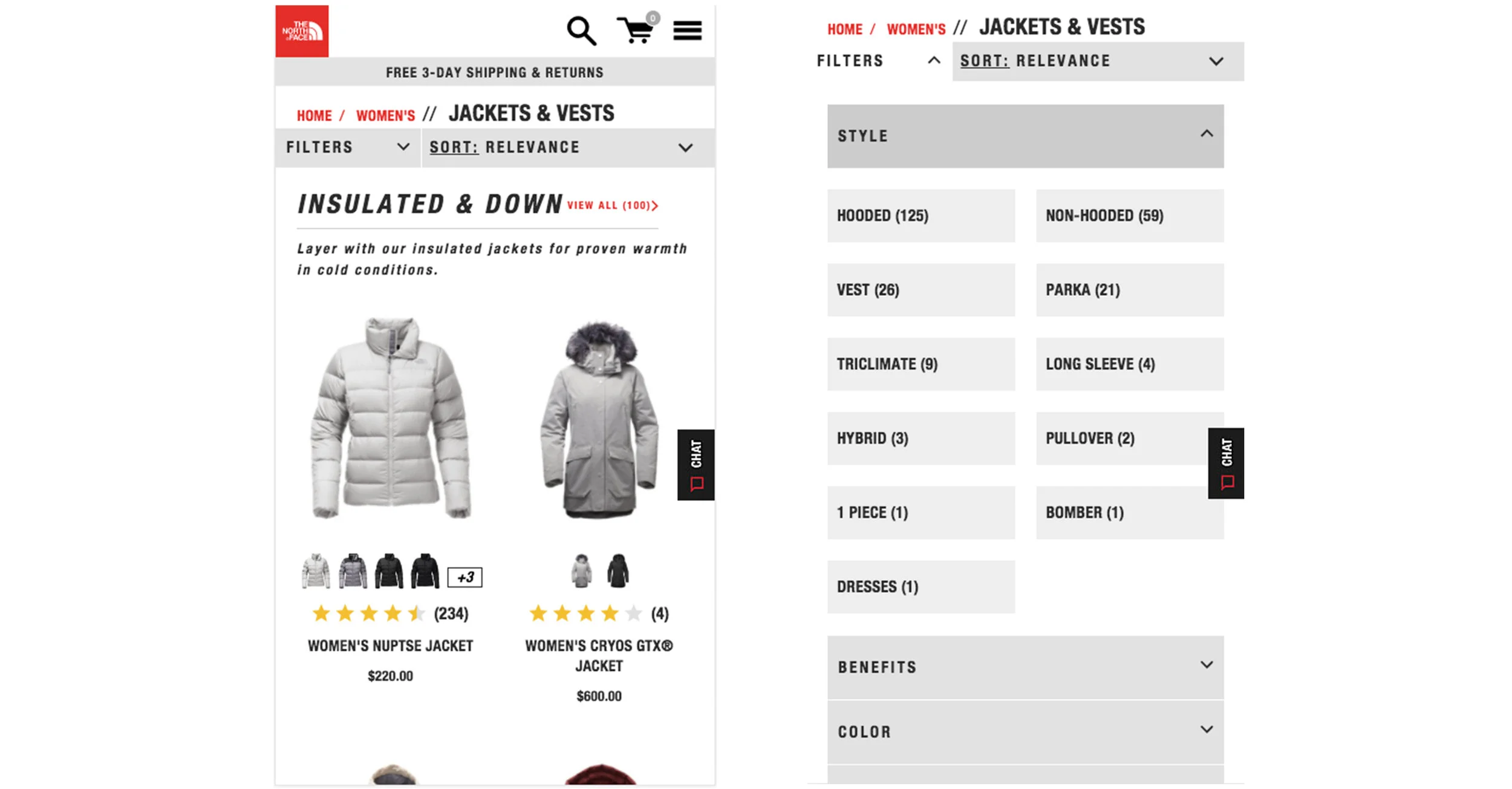
Filters Mobile 2012
The mobile functionality easily closed up the list of filters into a dropdown. This type of filtering system eliminated around 1500 lines of css and sped up load times by 1.5 seconds
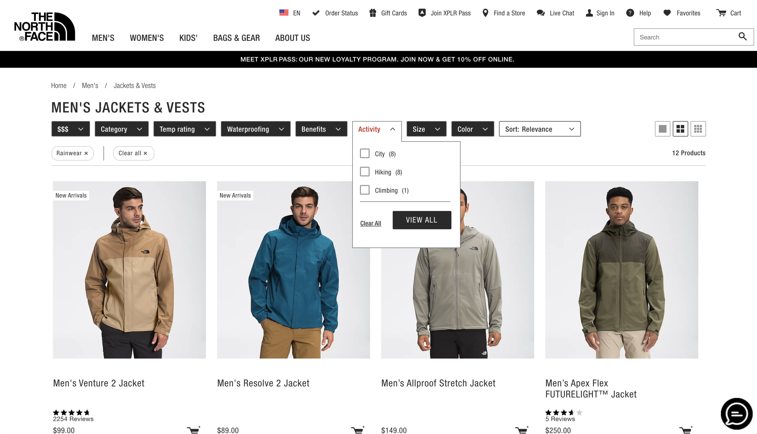
Filters Desktop 2016
By decreasing the font size changing the height and width of each filter section we were able to include more filters at a higher level
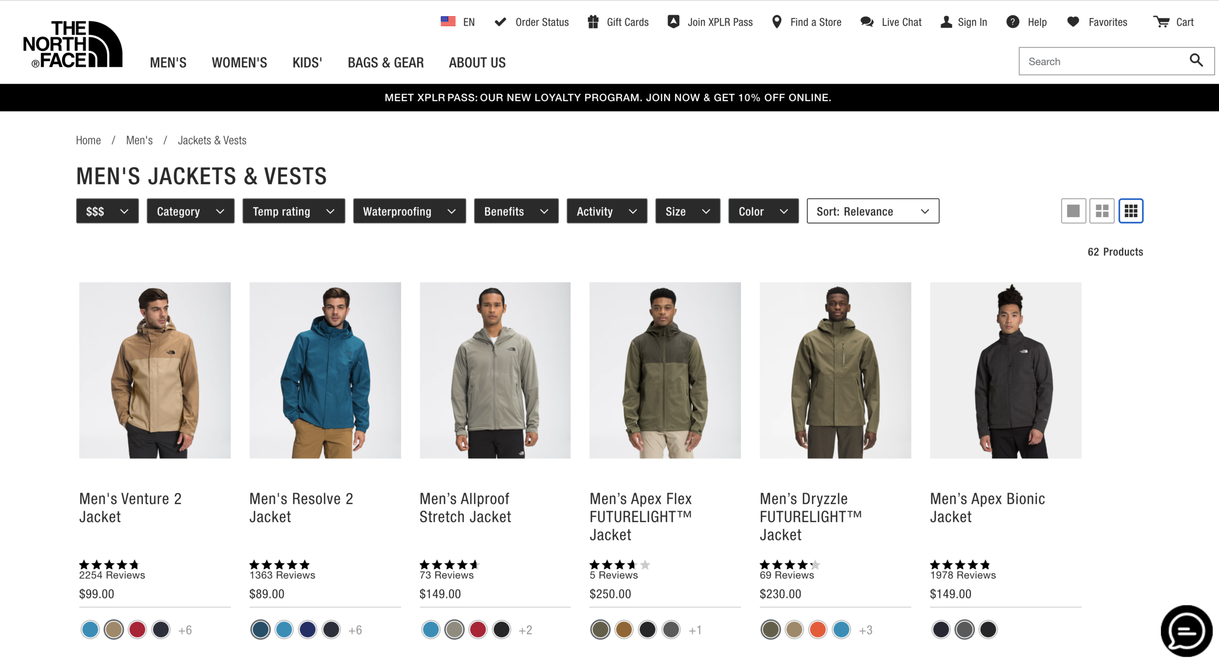
Filters Desktop 2016
We also added further functionality to the PLP by giving the user the option of controlling image size in the grid
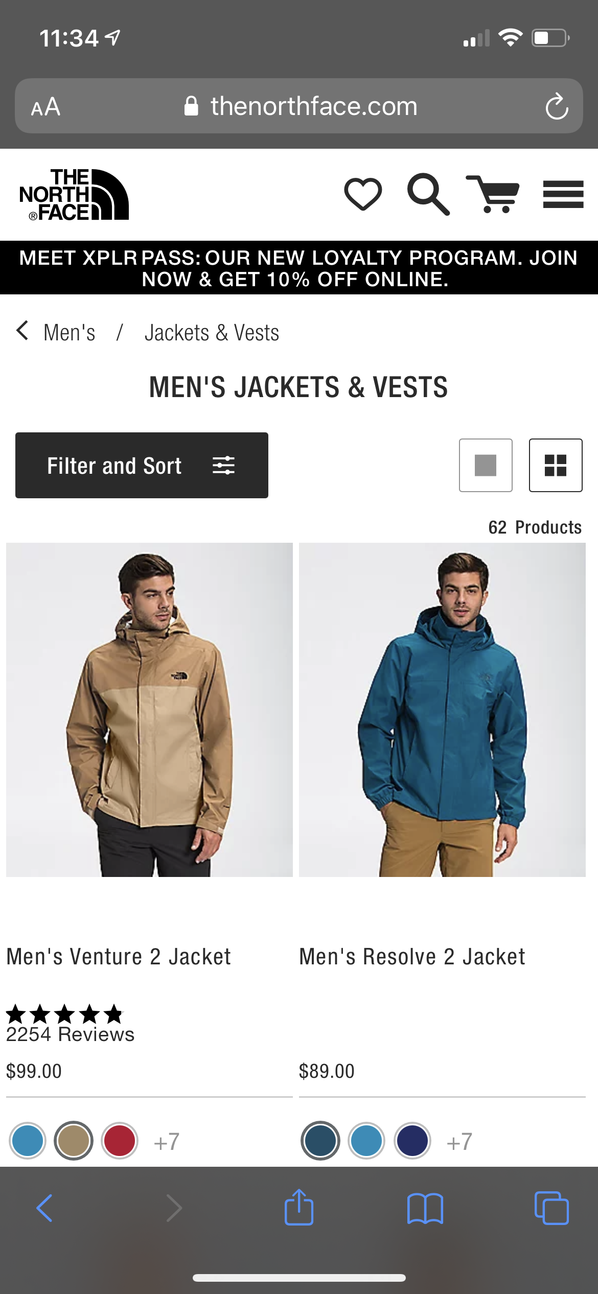
Mobile 2016 Closed Filter
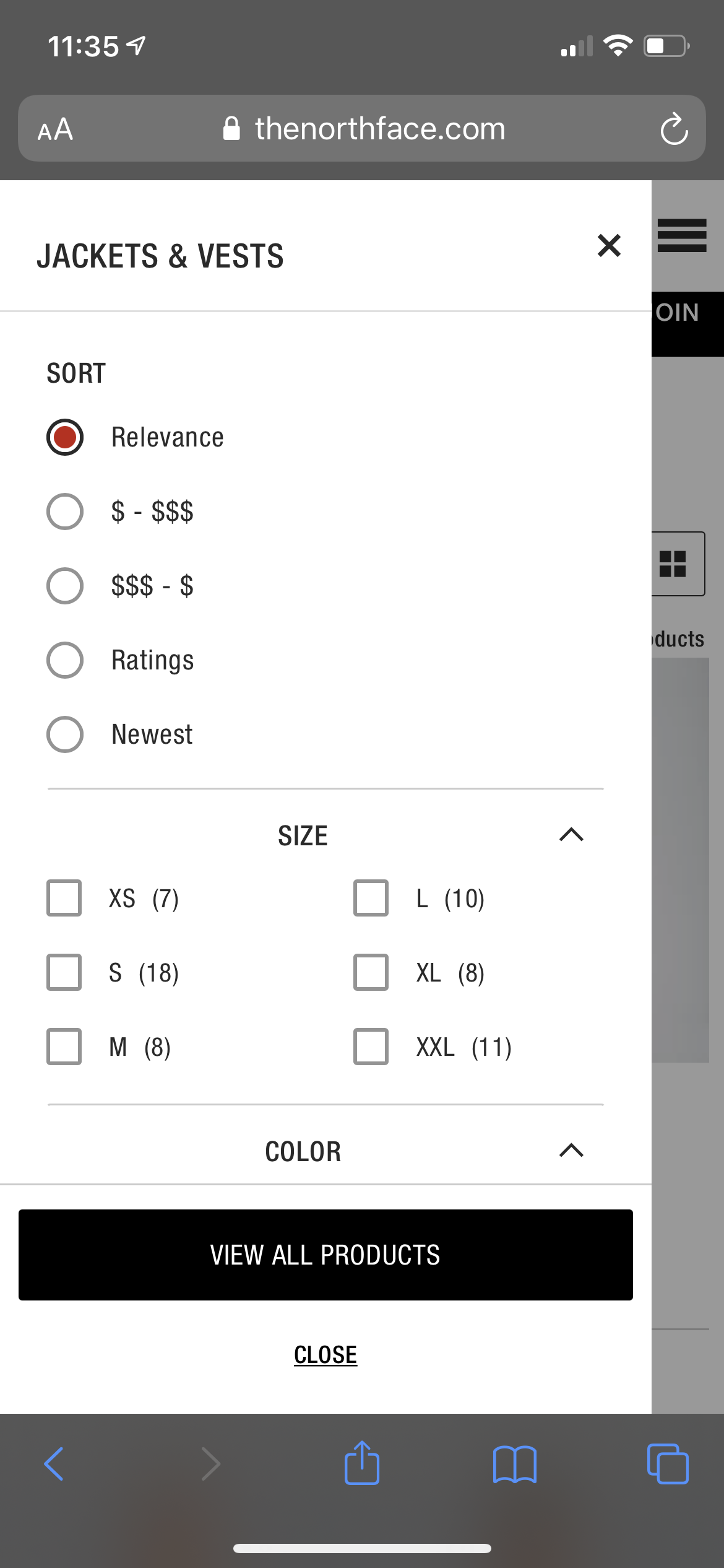
Mobile 2016 Open Filter